


A HOSPITALITY EXPERIENCE BRAND
BACKGROUND
Many people believe that an ideal night out includes three main components: First, it must be personalized to meet the needs of the group or occasion, should be a unique and novel experience, and lastly, should take place in a comfortable environment that promotes socialization. In many cases, however, these ideal nights become hard to access, expensive, complicated, time-consuming, and overcrowded. And of course, the pandemic has increased the inconveniences and decreased the desire of going out.
Night Inn reimagines the ideal night out by bringing industry professionals to you. It is a platform that offers in-person and online wine tasting and cocktail making experiences in the comfort of your own home. Guests can easily be connected to the Experts–talented sommeliers, bartenders, and chefs–in the Guest’s area. The necessary materials are then delivered to the Guest’s home before they enjoy this engaging and educational experience.
HOW IT WORKS

MY ROLE
In April of 2020, I was tasked with generating a brand identity for Night Inn. I started by experimenting with logo variations and soon after envisioned the entire aesthetic. I eventually earned the role of Creative Director of Night Inn, and I continue to work with them to develop elegant and dynamic marketing content for their social media and website.
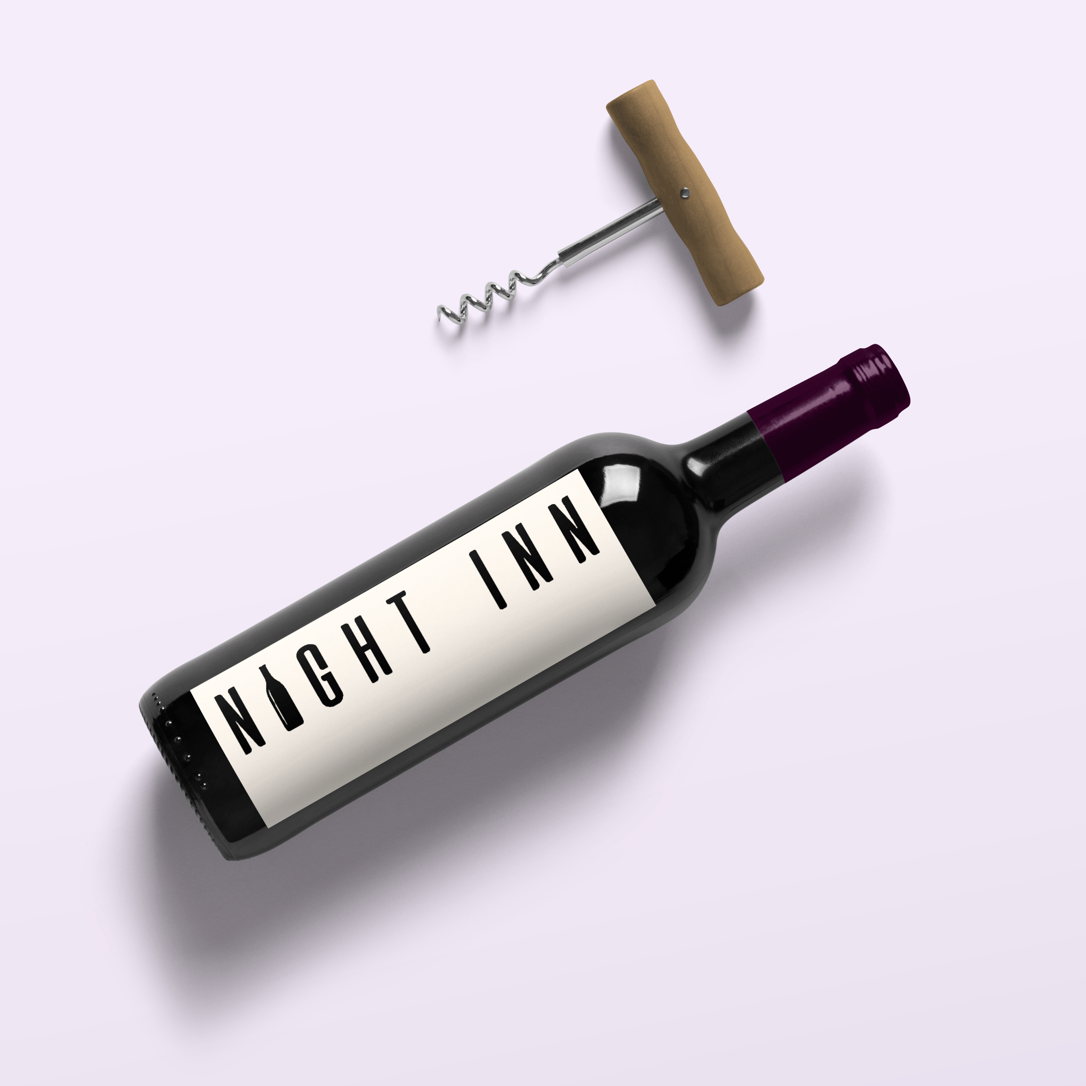
LOGO DEVELOPMENT
When developing the logo, I asked myself what words came to mind when I thought of Night Inn: togetherness, home, family, friends, elegance, experiences, memories. I began my logo design process with these words in mind, eventually finding a font that I felt fit best and pairing it with the bottle icon.

PIVOT DUE TO COVID
While the company planned to launch their in-person wine tasting and cocktail making services in early 2020, the pandemic caused them to shift gears. This led them to creating a sub-brand called OnlineVines that marketed virtual, pandemic-friendly wine tastings.

COLOR SCHEME

This color palette can be used both elegantly and playfully throughout Night Inn’s branding. The baby pink tone combined with the more neutral colors puts a trendy spin on the concept of wine tasting and cocktail making. Traditionally, these experiences are catered to an older demographic; however, this color scheme aims to inspire and spark an interest in a new, younger audience.
FRIDAY FEATURES

PROMOTIONAL CONTENT

Original marketing content for the company’s Instagram page @nightinnexperience created by linking together images, videos, graphic elements and text. I drew from the color scheme to create a warm and engaging aesthetic for a cohesive social media presence.