
REDESIGNING A CAFE ON CAMPUS


BACKGROUND
For the past 13 years, Manndible Cafe at Cornell University had been a hotspot for fresh local food. Loyal customers cherished this independently-owned cafe for its sustainability efforts, comfortable atmosphere, delicious menu, and its unique branding. However, Manndible Cafe was recently replaced by the university-run Mann Cafe. Since the transition, the cafe has lost its uniqueness and buzz. Therefore, Cornell Dining asked us to completely redesign and rebrand the cafe in order to increase its popularity and enhance the experience of the users.

DESIGN CONCEPT
Our group aimed to create an overall positive experience for the customers of the redesigned Mann Cafe. Looseleaf Cafe represents a departure from Mannible’s brand and brings a unique and enjoyable new personality to campus that people can appreciate in its own right, without needing to compare it to its predecessor.
MISSION STATEMENT
To create a welcoming cafe experience for all guests that promotes positivity and efficiency and maintains a memorable identity.
MY ROLE
In October of 2021, four design students and I formed a team to take on the challenge of redesigning Mann Cafe with representatives from Cornell Dining as our clients. My primary responsibility within the group was developing the entire brand image of Looseleaf Cafe. I was also very involved in determining the layout of the space and user flow.
REDESIGNING THE SPACE
DATA GATHERING & PROBLEM SEEKING
We surveyed and interviewed customers, staff, and other cafe goers, collecting information on why they go to Mann Cafe, how often they go to Mann Cafe, and what they think could be improved. Below is a summary of our survey findings:


THE PROBLEM
This data clearly indicated that the most prevalent problem was poor flow, leading to an overall inconvenient user experience. Interviewees also desired an improved waiting space and a more functional island counter. Also, the lack of signage makes the entire experience unnecessarily confusing. From these findings, we deduced a list of crucial customer needs as well as employee needs.
CUSTOMER NEEDS

EMPLOYEE NEEDS

SPACIAL SOLUTIONS

After defining the main problem, assessing the data we collected, and looking at research, our group was able to develop a list of spatial solutions that would effectively meet the needs of the users.
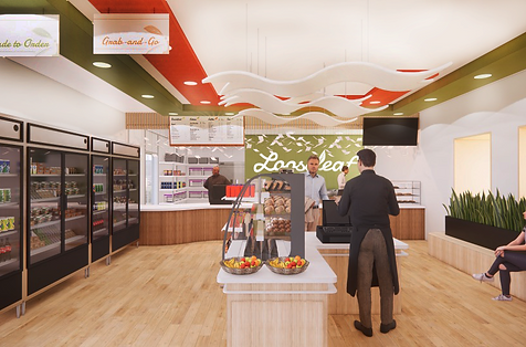
PROPOSED FLOOR PLAN

CIRCULATION DIAGRAM

REDESIGNING THE BRAND
BRANDING CONCEPT
As the weather in Ithaca is often cold and brisk, our cafe can provide a warm and welcoming destination for our guests to enjoy a hot cup of tea and a sandwich during any time of day. Our brand identity strives to foster a relaxing user experience as well as evoke feelings of freshness, reliability, and of course, deliciousness. All in all, Looseleaf Cafe represents a departure from the Mannible’s brand and brings a unique and enjoyable new personality to campus that people can appreciate in its own right, without needing to compare it to its predecessor.

LOGO DEVELOPMENT
After establishing the three driving concepts of Looseleaf Cafe’s overall branding, I wanted to develop a logo that was modern, captivating, and fun. I explored a range of typefaces and styles, and finally landed on two cohesive, unique logos. Below are some logo concepts that I created before deciding on the final one.

PRIMARY LOGOS


SECONDARY LOGOS

FONT SELECTION

Damion, our script font, shares an aesthetic with our cup logo and evokes an energetic and dynamic feeling, whereas Monserrat is modern and useful for creating large bodies of text and menu boards.

COLOR SCHEME
Our color palette features hues inspired by the beautiful Ithaca Fall season, aiming to bring positive energy into the cafe year-round. White and off-black are also included to add elegance and readability.
BRANDING VARIATIONS

FINAL DESIGN


